Posted on Leave a comment

Automated Bleeds, When and How

The newest feature based on the needs I’ve seen in submitted files is the ability to automatically add bleeds to artwork. Bleeds allow your print/cut operation to be a bit off and still not show up in the final product. Most stickers use a white border to avoid any issues but if you’re applying text or need an exact cut this isn’t an option. Previously there were just two options, the first was add a border:

In this worst case example adding a border really doesn’t work at all. It’s noisy, it’s ugly. I guess we could add some smoothing and make it a little better…..

Nope that’s actually worse because now all the shapes have welded together, it is nice and smooth though.

Without bleeds the best possible outcome would be to merely turn some of the image into bleeds by doing a negative padding value. Just a bit of negative padding should work!

It’s hard to make out in the small preview but we definitely have trapped all the cut lines into the printed area, but the thin lines have been obliterated and the letters are looking a bit funny. So…let’s take a look at that same image with automatic bleeds….

And that’s it! All the cut lines are at the original image boundaries, no loss of detail or sharpness, plenty of over bleed to ensure your print and cut line up.

Posted on Leave a comment

Making Center Cuts

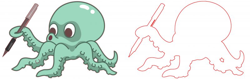
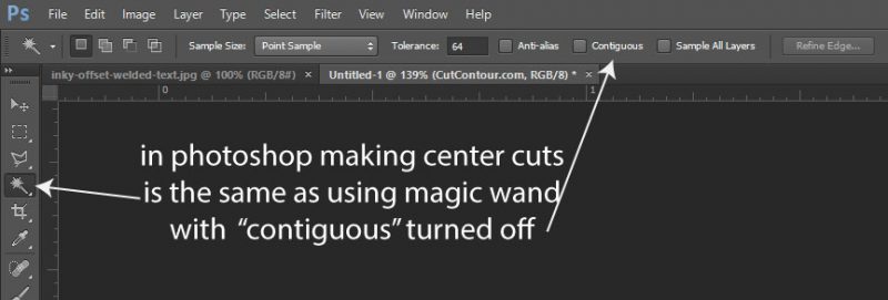
Making center cuts means removing the background even when it’s inside an object. In Photoshop you can select your background alone or all background everywhere. This is known as contiguous versus non-contiguous selection.

This can either turn out really well for you or really poorly depending on the original intent of the artwork. It can turn out especially poorly if your source file is a JPG which lacks transparency data, meaning that white can be both background or content and it’s hard to say which. Let’s look at some good and bad examples:

In the image above I have a transparent background, most likely a PNG, and I’ve selected the background with contiguous turned off, which will cause for the center of the letter “O” to be selected. This is definitely what I want to happen, the alternative is shown below:

I’ve added a background color to help illustrate our problem here. With contiguous turned on we’ve now lost our center cutouts and our letter “O”‘s will not get removed.

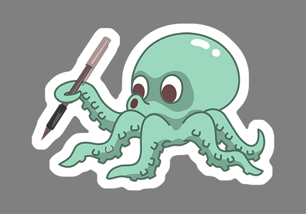
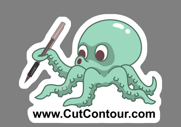
When you have a professionally made file with well defined transparent regions the answer is obvious that you almost always want center cuts and to remove the entire background. Plus…don’t forget if there are a few small areas you don’t want to remove you can always just remove those cut outs from the file when you’re done.

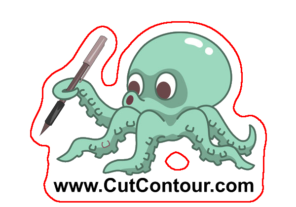
So now let’s look at the area where center cut-outs are most likely to cause an issue. Rather than a nice clean PNG suppose we have a JPG, it’s the only thing the client has, and it’s mixed white background and content:

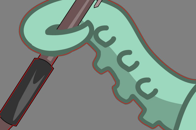
Here you can see we’ve selected the white background, non-contiguous selection, to create center cuts. Our letterring is great but our friend inky is now missing his eyes and a bit of his brain. There are two solutions to this, one is to run the file like this and then remove the paths we don’t want in illustrator. The other is to add some path offset until the internal selections close up and the text body welds together:

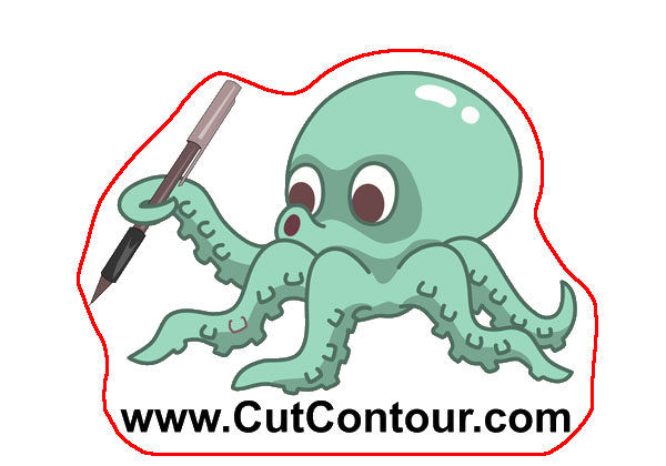
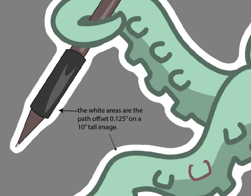
By expanding our selection and creating a 1/8th inch offset we now have a file that’s a lot easier to cut and most of the unwanted cutouts have vanished. We still have to remove one path between the logo and text but this is a lot closer than before.

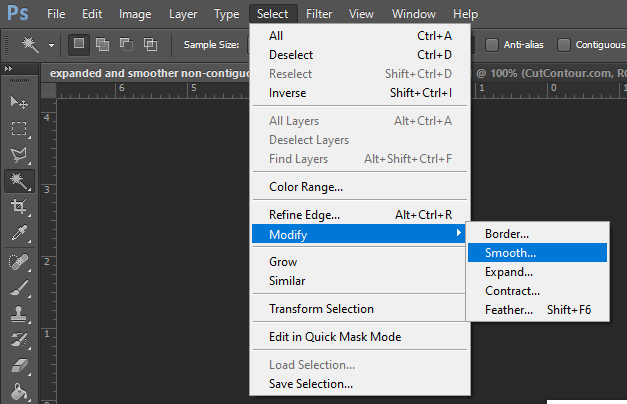
If that sounds like too much work then one option is to not only expand our selection 1/8th inch but also to smooth our selection.

Expanding and smoothing will give results as below. I personally think it lacks a lot of the character of the previous example but it will definitely be easy to weed. Given my choices of a bit of touch up work or a lumpy potato shape I would choose some manual retouch.

The cut contour program does not currently offer smoothing but you can do this in photoshop easy enough.

Thanks for reading this article and please go give my program a try and as always I’d love some feedback.

Posted on Leave a comment

Understanding Cut File Path Offset

The most basic setting when creating a cut file is the path offset. This value can be positive, negative, or zero, all depending on what you’re trying to achieve. Let’s talk about these in order:

Positive Path Offset

This is the most common setting when creating stickers. This adds the specified amount of border around the image smoothing it out, making it easier to cut.  An example of a typical 1/8th inch offset for a sticker file:

Sometimes though you would like to achieve more than an easy to cut file and have it also be easy to weed.  Increasing the path offset will cause the various parts of the shape to weld together into one big shape.  Here is the same image with 1/2″ of path offset added, see how all the internal areas close in to make one easy cutout of the shape.

More than just making files easier to cut and weed you can also use path offset to weld together separate objects in an image, like this text plus image below:

Zero Path Offset

Zero path offset is for when you want an exact trace of a shape.  Maybe you have an oval, circle, or square and that’s what you want the output to be, exactly as the image file appears.  Zero path offset isn’t always great for print and cut because you won’t have any bleed area, but if you’re cutting solid color vinyl it’s the perfect setting.  Below is an example of a single color file with zero path offset:

Getting a good trace from zero offset can be hard due to image artifacts.  You’ll definitely want to play with the advanced settings.  You want to have a high quality 300dpi file for the best results.  If you don’t have a high quality file then you will want to increase the “Line Deviation” in advanced settings.  The default setting is .0045″ which is 1.35 pixels at 300 dpi.  If your file is 100 dpi you want to triple this to 0.015, and if it’s a bit jagged, double it again to 0.03″ and you will get smooth results.  If your file has a lot of straight lines you’re hoping to preserve also adjust the “Preserve Angles Sharper Than” setting to a lower angle, the default of 1.05 is about 60 degrees, lower this to 0.50 or less.  If you lower the sharp angles value to zero the file you get will be nothing but straight lines but they will be very close to the source material and in many cases may be your best bet.  Creating a high quality exact cut file can be challenging and ultimately that is one of the reasons we offer paid services.

Negative Path Offset

Negative path offset turns your graphics into “Full Bleed” graphics. Bleed just means that something gets cut off. If you add a color outline to your image, or have an image that can afford to lose a bit of the edge, then setting a negative offset will ensure you don’t have white edges on the image. Try a small value like 0.06″, which is 1/16th an inch, and you’d be surprised how well it works with most images. adding a bleed region by negative offset will not only make your final product looks nicer it will also help smooth out the cut path in the same way a positive offset does.